Press kit
The Route Royal identity for anyone writing about us: where the name comes from, how the mark is built, the logos and colours to use, and who to talk to.
Every logo in three inks, as SVG and PNG · 424 kB
From the brand book, version 1.12026Elementary Digital
01The name
The royal road
Route Royale is the road that holds Mauritius together. Almost every country has one, and calls it the same thing. A business deserves one too.
Mauritius
On the island where Route Royal was built, the Route Royale runs along the coast and through the towns, joining each to the next. Every smaller road eventually meets it. Nobody has to be told where it is. It is simply the road.
Every country has one
- Royal Road
- Persia, from Sardis to Susa
- Via Regia
- The Holy Roman Empire
- Camino Real
- Spain and the Americas
- Kongevejen
- Denmark
- King’s Road
- Britain
- Route Royale
- Mauritius
The names differ; the role never does. It is the one route a nation keeps open and in good repair, the one that everything else connects to.
What the road does for a business
A company today runs on dozens of narrow tools: one for invoices, one for bookings, one for contacts, one for documents, one for approvals. Each is a side road and none of them meet. Information travels badly, and people become the bridges.
Route Royal is the main road. One route the whole business travels, where every record joins every other, so that a question asked anywhere is answered from one place.
The royal road for business.
The line explains the name twice over: a royal road is the one route everything else joins, and in the old idiom it is also the easy way.

02The mark
A crowned phoenix
Built from one stroke, one gap and one grid. It is the asset everything else in the identity points back to.
- 01
The pitch
Every stroke is 6 units wide and every gap is 4, measured square to the line. Together they make a pitch of 10, and every other measurement is a multiple of it.
- 02
Columns and rows
Vertical strokes sit on columns 5, 15, 25 and onward from the axis. The wing tops step down one row of 10 at a time, and the box is 136 by 204, exactly 2 : 3.
- 03
Two families of diagonals
Lines running down to the right pass over lines running down to the left. Where they cross, the lower line stops one gap short, so the weave reads as one thread from crest to talon.
- 04
One cut line for each zone
The wing feet end on one 45° line and the leg feathers on a second line parallel to it. The shoulders are cut by chamfers one pitch apart, so the R keeps a square corner.
Rules of the mark
- Always the master vector. Never redrawn, traced or “cleaned up”.
- One colour only. Never two tones inside the mark.
- Never use it as a pattern, and never crop or rotate it.
- Below 160 px wide, use the mark alone. Never set the mark smaller than 32 px tall.
03Logos
Lockups and colourways
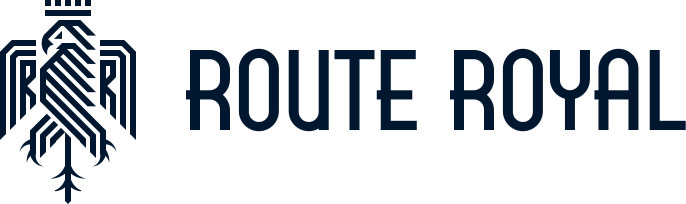
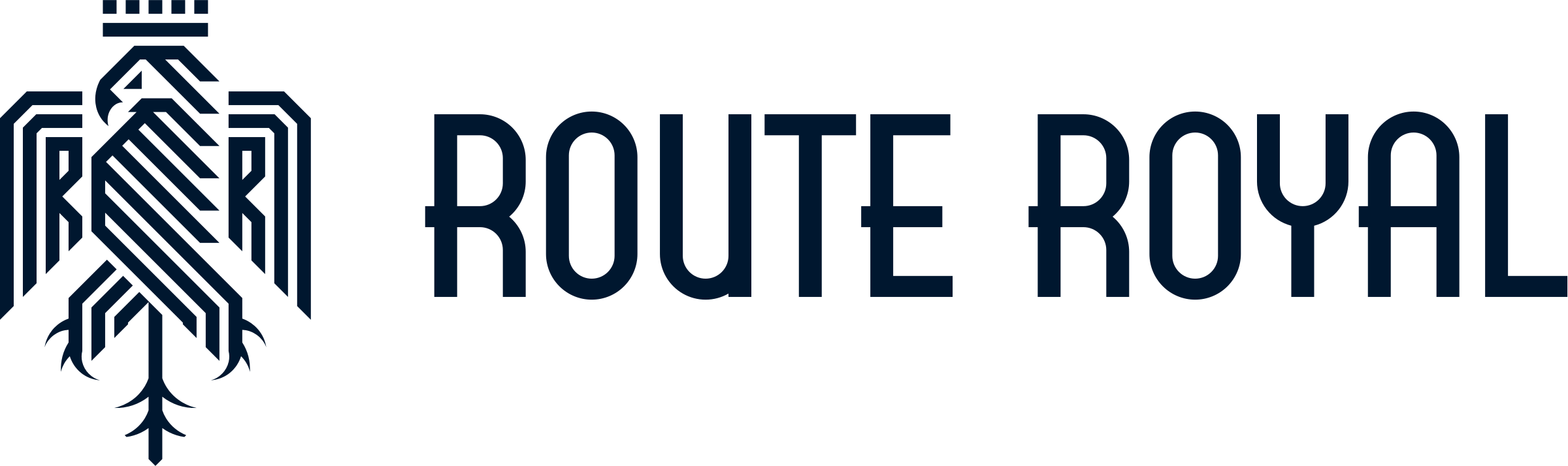
Four logos and four approved pairings of ink and paper. Choose by the background, never by taste, and download exactly what you see.
03Clear space and minimum size
Give the logo room
The unit x is five pitches of the mark, the same distance that separates the mark from the word in the horizontal lockup.
Minimum sizes
- Mark alone32 px · 9 mm
- Stacked lockup96 px · 25 mm
- Horizontal lockup160 px · 40 mm
Each logo is drawn here at its smallest size. Screen sizes are CSS pixels at 1×; print sizes are the height of the mark or the width of the lockup. From 51 px tall, every gap in the mark is at least one full pixel.
03Misuse
If it has to change to fit, the layout is wrong
Eight things never to do to the logo. Each is drawn here from the real one.
Don’t stretch or squash
Don’t rotate
Don’t outline
Don’t add effects
Don’t use an off-palette colour
Don’t change the lockup
Don’t typeset the name
Don’t place it on a busy background
04Colour
Ink on paper
Prussian ink, unbleached paper and one vermilion accent. Select a colour to copy its value.
Core: the inks
Oxford Blue
#00172F · 0 23 47
Primary. Text, structure, the mark.
Delft Blue
#27425D · 39 66 93
Secondary surfaces, hover states, dark screens.
Payne’s Gray
#52697F · 82 105 127
Secondary text, icons.
Slate Gray
#758798 · 117 135 152
Tertiary text, metadata, captions.
Cool Gray
#93A0AD · 147 160 173
Borders, rules, disabled states.
Paper: the grounds
Champagne
#F3E7CF · 243 231 207
Warm highlight surfaces, print.
Antique White
#F8F0E1 · 248 240 225
Cards, panels, table headers.
Seashell
#FCF8F0 · 252 248 240
The default page.
White
#FFFFFF · 255 255 255
Inputs, content surfaces in the product.
Accent, used sparingly
Tangelo
#E85339 · 232 83 57
The one accent. Actions, emphasis, the route line.
Royal Ink
#0A4AC5 · 10 74 197
Illustration ink only. Never for type.
05Typography
Three faces, three jobs
A condensed display face that echoes the wordmark, a quiet sans for everything you read, and a mono for everything you measure.
Display · Big Shoulders Display
The royal road for business.
Tall, condensed and geometric, with the same proportions as the wordmark, so headlines and the logo read as one voice. Black for hero lines, Bold for section titles. Sentence case, tight leading, never tracked out.
Text · Instrument Sans
Route Royal holds the customers, deals, projects, properties and documents a business runs on, and the workflows that move them. Everything is one record away from everything else.
A humanist grotesque with a slightly narrow set, so dense screens stay calm and printed text stays economical. Regular for reading, SemiBold for headings and controls.
Data and labels · Sometype Mono
DEAL-2026-000412 · MUR 4,250,000
STAGE PROPOSAL · UPDATED 30 SEP
Identifiers, amounts, timestamps and section labels. Tabular figures, so columns align.
All three are open licences from Google Fonts, free to use in print, on the web and in video.
06In the press
Route Royal in the news
Coverage as it appears, and a description of the company you’re welcome to quote.
Coverage will be listed here
Route Royal is new, and we’ll list articles, interviews and podcasts here as they appear. Writing about us? Get in touch for a briefing, a demo or answers to your questions.
About Route Royal
Route Royal is the AI Business Operating System. It brings sales, bookings, marketing, websites and project delivery onto one platform, with Q, its own AI, working across all of it, and packs for property, vehicles and commerce. Businesses can also work in Route Royal from Claude, ChatGPT, Codex and Cursor. Route Royal is made by Elementary Digital.
- Company
- Elementary Digital
- Product
- The AI Business Operating System
- AI
- Q, built in, and Claude, ChatGPT, Codex and Cursor
- Plans
- Paid plans, monthly or yearly, with a free trial
- Website
- routeroyal.com
07Contact
Talk to us
For interviews, briefings, demos, images or a quote, write to us and tell us your deadline.
Route Royal press kit2026
Press kitThe last sheet
The whole kit, in one folder
Every logo on these sheets in three inks, as SVG and PNG, with a README of the rules that go with them. For anything else, the press team is one email away.
Point at or tap a piece to see what it’s for.
In the zip
- 24logo files: four logos in three inks, as SVG and transparent PNG
- 1README with the colourways, clear space, minimum sizes, misuse, palette and typefaces
- 424 kBin one zip, ready to download
Press contact